


The 7 Elements of Modern Web Design
Every year while changing environment we see new ways to design a website, there are many new elements emerge in website designing. These are not necessary elements to add in your website but as you know we follow peoples trend, the more to include the better you new website design will be.
I know a very big question raise in your mind, how to figure out the latest elements what should include and what to exclude blah blah…., don’t be upset I’m here to help you. I’ve deep research on market trends specially in designing.
Here are 7 most important elements in your modern website design. just follow my simple and elegant rules for modern website design. you don’t need to add all elements in your website but to add some of them will create a master piece. So lets start.
1. Choose Unique Typography

Its the first and most important element in web designing, we can’t deny the importance of typography, many big companies used different types of typography that helps their customers to recognized them easily. From the last 10 decades the selection of unique fonts has grown specially in logos and websites.
The New Yorker‘s fonts selection quite different that’s the main reason their customers around the world recognize them easily.
2. Flat Design

Flat website design focus on company’s vision and its main content not on rushy design with a lot of colors. flat designed websites allows its user to get the right information by focusing the sections where the end-user come to see or read, rather then the fancy design etc.
basically flat design use minimalistic style that provide more white space with neat and elegant spaces and elements places. Many great designers design a website in the way to provide more spaces in their design to focus on content not the designed elements.
Let me show an example of flat design Focuslab have a neat and slick flat design where you can see the main point is to focus on content not on design.
3. Should Have Hover Effects

While designing a website you should keep in mind your website includes all hover effects where you want the end user should visit. Hover effects are the great elements to increase user experience. Website does’t complete until you have not add hover effects, the design is not intrusive until hover effects it helps users keep in track where you want they looking on the page.
They helps you to identify where are you on the page? when you looking any website you can see there are some parts in your website that usually change their color or may be highlights to ensure where you are looking.
4. Scroll to Page Sections
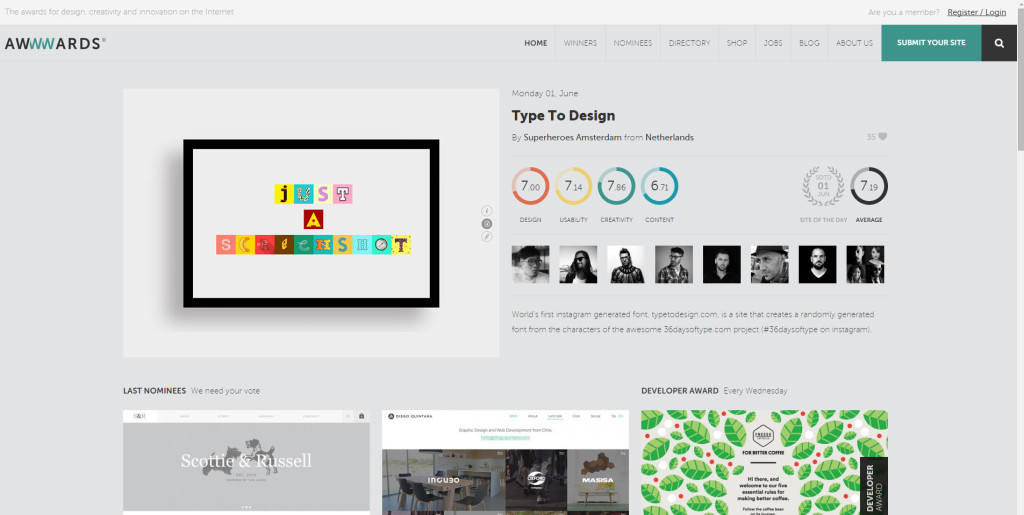
Having a scroll in your design is better for visitors usability. if you are dealing in one area you should use scroll in your design because its better to get all information on one page instead of clicking on multiple pages. So your content will display on one page but be careful while designing sections, your sections should have proper sense where they are, you should be careful for user experience.
There are many advantage of scrolling in your site, the main one is when a visitor come to your site again, he knows that section and get the information. He does’t need to go page by page to get a single piece of information.
You have seen many website, where you click a link and take you to the different page of that page. for example Awwwards use this technique and we also use the same one. they provide links in the main navigation, when you click on any link like click on our stories you’ll reach our story section on the same page.
5. Giant Product Images

While designing a website you should use large high quality image of products to describe different features of a product in more efficient and effective way. By using giant images it keep the visitors to think about product because you know visual impact of any product is more valuable then any other. As you know we need content to explain what our product do, but using big images with full features half of the content work reduced. Using big images we are able to provide solid idea of what the different products do and we can convey it through images instead of big paragraphs of content.
I like to give the best big images product website is Apple. they have used big and high quality images of their products, very neat and sleek website design with beautiful places for each product. if you’ve visited big eCommerce website B2B, you’ve noticed they starting their website with large displaying product images to show you the main and different features of their product. This is the main design tactic to show end-user what you want to show off, in this way end-user have focus on main products through out the whole website.
6. In-Depth Product Videos
According to the reasearch of inc. magazine
92% of B2B customers watch online video and 43% of B2B customers watch online video when researching products and services for their business.
That’s why many B2B companies prefer to create the video of their own products to explain what is actually, you know in this busy life we have no time to search and analyses whole website for purchasing a single product. therefore video is the best and small medium to explain everything in 5 mints.
Making the video of their product its easy to learn how to use the product in best way and what the main benefits we can get from the product. its also helping us to reduce help queries. many customers watch the video and analyse how to use it and definitely they will buy your products.
7. Large, Responsive Images

While designing your website one thing keep in mind, your website will be viewing on all devices like tablet, desktop, large screens, mobiles etc. You valuable customers come all around the world having different devices. images using by Wear and Cheer is extremely powerful, if they just develop their website only for desktop many people may miss them to see.
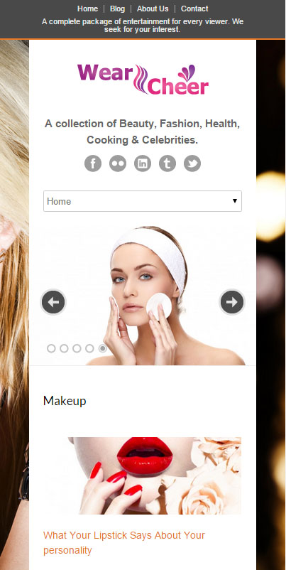
Be ensure your images are responsive for better and good user experience, your website visitors can look at different images in your website rather its background image or product images. Ensure they get the same experience no matter which devices they are using. As you know now a days more and more people does’t use desktop computers only to find out information about different products from different companies, they are using multiple devices so make a responsive design that will pen on all type of devices.


No Comments